Trend color palettes for balcony green spaces in 2025 are making it easier than ever to bring charm and tranquility to your outdoor space — without going overboard.
This year, the focus is on soft, natural tones that pair well with plants and simple furniture. Nothing too bold, just warm colors that make your space feel inviting.
Let’s take a look at some of the color combinations that are trending right now and how you can use them in practical ways — even if you’re just working with what you already have.
Trend Color Palettes for Balcony Green Spaces in 2025: What’s Defining the Year
Trend color palettes for balcony green spaces in 2025 are all about subtle contrast, grounding tones, and soft transitions that reflect a more relaxed and functional approach to outdoor living.
Instead of bold, attention-grabbing colors, the focus is shifting toward hues that blend naturally with plants, furniture, and the rhythm of daily life.
The Core Tones Taking the Lead
In 2025, three main color directions are emerging for balcony green spaces:
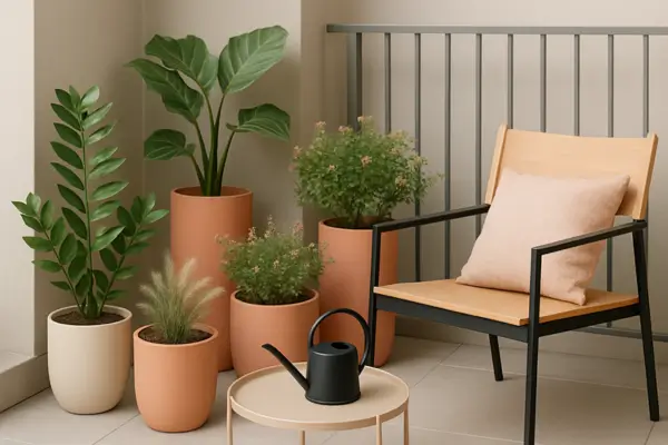
- Muted earth-inspired tones – Think soft terracotta, clay beige, and olive green. These colors work beautifully with natural pots, wood textures, and leafy plants.
- Soft botanical palettes – Sage, eucalyptus green, dusty lavender, and off-white are ideal for pairing with vertical planters, trailing vines, and herb gardens.
- Cool-neutral bases – Pale stone gray, light sand, and foggy blue create a calm backdrop for brighter greens to stand out without overwhelming the space.
These palettes aren’t meant to dominate the garden—they complement it. The goal is to create a space that feels quiet, fresh, and lived-in, where color supports rather than competes with the plants.
Why Color Matters in Small Outdoor Areas
In limited spaces like balconies, color plays a functional role. It can help visually expand the area, create zones of activity, or highlight particular features like a hanging planter or cozy seating corner.
Using a consistent palette across pots, cushions, trellises, and flooring creates a clean visual flow—even in a 2m² space.
How to Combine Plants and Colors for a Cohesive Balcony Look
Balancing plants with your color palette is what makes the whole design come together. The idea isn’t to match every leaf with every pot, but to create a quiet conversation between texture, tone, and structure.
Start with the Focal Point
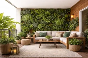
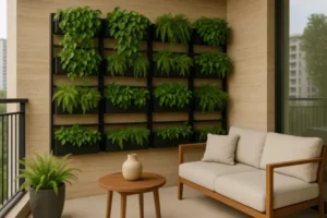
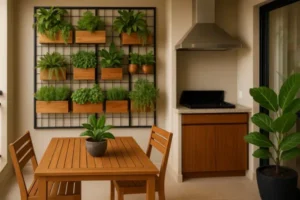
Every small green space benefits from a centerpiece. It could be a tall plant, a colorful chair, or a feature wall with vertical planters. Once you choose that focal point, you can build the color palette around it.
For example:
- If your focal point is a vertical herb garden with deep green leaves, consider neutral planters in pale clay or gray to avoid clashing.
- If you’re using flowering plants like lavender or begonias, use pots in soft greens or creams to echo the bloom without repeating it exactly.
This helps create a layered look that feels organic and intentional.
Don’t Overload the Palette
A mistake many people make is using too many shades. Stick to two or three base tones and use natural green as the fourth color. Plants already bring their own shades—bright lime, deep emerald, blue-gray foliage—so the supporting elements should not compete.
Here’s a basic combo that works well in most urban balconies:
- Base 1: Soft gray or taupe (planters or flooring)
- Base 2: Eucalyptus green or sage (accent chairs, watering can)
- Base 3: White or warm beige (cushions, wall paint)
- Plants: Mix of trailing greens, upright herbs, and one feature bloom
When done right, this blend helps the plants shine while giving the whole space a cohesive mood.
Matching Color Palettes to Different Balcony Styles
The style of your balcony influences how colors behave. A warm, rustic setting asks for a different visual rhythm than a sleek, modern one. When your color palette matches the tone of the space, everything feels more connected—even when you’re mixing different materials or plant types.
For Clean and Minimalist Designs
If your balcony is simple and clutter-free, stick with calm, low-contrast colors that let the plants become the highlight. Cool gray walls, matte white pots, and a single type of lush green plant can create a space that feels peaceful and intentional.
A minimalist palette doesn’t mean boring—it means giving each element room to breathe.
Imagine a narrow balcony with pale gray tiles, a line of white planters, and tall green ZZ plants. Add a soft black chair and a simple watering can, and the whole space becomes a visual retreat without trying too hard.
For Cozy and Rustic Corners
Rustic balconies are about warmth, texture, and personality. These are the spaces where wood, clay, and handmade items shine. Earthy tones like terracotta, warm beige, and muted olive naturally blend with materials like jute rugs or stone planters.
Plants like lavender or trailing rosemary add movement and scent, without overwhelming the senses.
You’re not aiming for perfect symmetry here. The charm comes from slight variation and raw finishes that look like they’ve aged beautifully over time. A rustic palette is forgiving, flexible, and invites you to relax.
For Bold, Modern-Chic Vibes
Modern balconies, especially in urban apartments, often lean toward contrast and clean geometry. Here, a more dramatic color story works well—soft black paired with pale ivory, or charcoal walls with gold-trimmed planters. These combinations feel upscale without being flashy.
To make it work, keep one accent color (like dusty rose or peach) and apply it with intention—maybe in a single chair cushion or a patterned ceramic pot. Then let structured plants like snake plants or monstera bring in that living energy that softens the lines.
Each style offers a different mood. Matching your palette to the personality of your balcony turns a functional outdoor space into something you genuinely want to spend time in.
Seasonal Shifts: Adjusting Your Color Palette Through the Year
Balcony spaces go through subtle changes as the months pass—even if the structure stays the same. The light shifts, the plants grow or rest, and our mood for color evolves naturally.
Instead of starting over each season, you can refresh your space by adjusting just a few elements while keeping the core palette intact.
Let the Light Guide Your Updates
The way natural light hits your balcony changes between winter and summer. In cooler months, softer sunlight can make pale colors look flat. That’s a good time to bring in warmer accents—like swapping a cushion cover for one in rust or honey yellow.
During brighter months, bolder tones may feel overpowering, so it’s better to return to softer shades that won’t compete with the sharp sun.
One easy trick: keep a rotation of fabric elements—throws, seat covers, or table runners—in complementary tones that you can change out with the seasons. This keeps the base palette consistent while adding a layer of seasonal mood.
Plants as Seasonal Color Anchors
Some plants naturally bring seasonal color changes. For instance, red lettuce or maroon coleus add depth during fall, while soft-pink pelargoniums pop during spring. Instead of replanting everything, try rotating two or three potted plants that reflect seasonal tones.
You can also play with the color of plant containers. Using removable pot sleeves or trays in different finishes—like matte white for summer and terracotta-style for autumn—gives flexibility without disturbing the soil or roots.
By making these shifts intentional, you create a space that feels alive and in tune with the time of year, without becoming high-maintenance or chaotic.
How Microclimates Affect Color Perception in Balcony Gardens
This is one of those hidden design truths that most people overlook: the way you perceive colors in your balcony garden can change depending on your microclimate. A south-facing balcony in Lisbon won’t “show” the same color tones as a shaded corner in Amsterdam—even if you use the exact same paint and plants.
What Is a Microclimate?
In simple terms, a microclimate is the unique combination of sunlight, wind, humidity, and temperature that exists in a small outdoor area. Every balcony has one, and it directly influences how colors appear to the eye.
Let’s break it down with real examples.
How Microclimates Shift Color Perception
Here are key ways your balcony’s microclimate changes the way colors are seen and felt:
- Light intensity changes the tone
On bright, sun-drenched balconies, soft colors can look washed out. Pale green might turn almost gray. Meanwhile, strong light makes deeper shades like charcoal or terracotta feel lighter and warmer than they really are. - Shaded or indirect light softens contrast
If your balcony only gets a few hours of light—or is covered by a canopy—your color palette will appear more muted. This is where warm neutrals like clay, beige, and mustard can stand out without overwhelming the space. - Humidity and moisture affect texture perception
On humid balconies, glossy surfaces (like glazed pots) will reflect more ambient light, which can make color shifts more noticeable throughout the day. Matte finishes, on the other hand, appear steadier and less reactive. - Temperature influences your color comfort
On balconies that get very hot in the afternoon, warm color palettes might feel overwhelming. Cooler tones like eucalyptus green or foggy blue help visually “cool” the space—even if the temperature stays the same. - Wind exposure shifts your attention
In windy areas, movement draws the eye. That makes color placement important. You might want to keep brighter tones close to the center, where visual noise is low, and softer tones on outer edges where plants sway more often.
Design Tip
Before finalizing your color palette, spend a few days observing your balcony at different times—morning, noon, and evening. Snap a few photos of the same objects in different lights. You’ll start to see how the setting changes your perception.
This small step can help you choose tones that remain pleasant and consistent, no matter the time of day.
How to Apply 2025 Color Palettes Using What You Already Have
One of the best parts about decorating a balcony is that you don’t need to start from scratch. Most people already have items that can be repurposed, refreshed, or rearranged to align with the trend color palettes for balcony green spaces in 2025.
The secret is to look at what you own through the lens of color and placement.
Start by Grouping What You Have by Tone
Take a good look at your planters, furniture, trays, baskets, textiles, and accessories. Group them into piles based on color families: cool tones, warm tones, neutrals, and bolds. You’ll be surprised at how quickly a pattern emerges.
Once you’ve done that, pick a primary base palette. You can do this visually—just notice which tones feel most present or most pleasant. Use those as your anchors. The rest can be rotated, stored, or used sparingly as accent pieces.
Simple Ways to Rework Items into the 2025 Trend Palette
Here’s how to bring your space into the 2025 color vibe without spending too much:
- Paint or spray old pots
Terracotta, sage green, and matte beige paints are easy to find. One afternoon of painting can transform a mismatched set into a cohesive statement. - Dye or swap out fabric items
Have white or faded cushions? Try fabric dye in clay or eucalyptus tones. Or, just switch the covers using affordable linen or cotton in your desired palette. - Use trays and crates as organizers
Wooden trays or boxes in muted colors can group small pots and tools, giving a more structured feel. If they’re raw wood, consider staining them in light walnut or earthy gray. - Rearrange by visual weight
Put lighter-toned items closer to eye level and deeper or stronger colors at the bottom of vertical structures. This naturally guides the eye upward and creates balance. - Introduce seasonal elements
A simple bunch of dried grass, a repurposed ceramic bowl, or even a candle holder in seasonal tones can freshen the look instantly.
You don’t need a designer budget to make a space feel intentional. A clear eye for tones, a willingness to experiment, and a bit of creative reuse go a long way.
Conclusion
Using the trend color palettes for balcony green spaces in 2025 is a fun and simple way to bring new energy to your outdoor space. Just a few color changes can highlight your plants and make the whole area feel more alive and welcoming.
It’s all about noticing what works for your space—how the light falls, which tones feel good together, and what makes you want to spend more time out there. Small updates here and there keep everything feeling fresh and personal.
The best part? These palettes are just a starting point. You can mix, adjust, and make them your own. With a little creativity, your balcony becomes a space that reflects your style and brings a bit more joy to your everyday.